Many businesses start an online shop project with a simple idea: we have products and want to sell them online. So the shop needs product images, prices, a cart and payment options. Technically, that is correct. From a business perspective, it is not enough.
A successful online shop is not just a digital product catalogue. It is a sales system. It needs to understand visitors, reduce doubts, explain products clearly, build trust and make the purchase as easy as possible. This is where shops that are simply online differ from shops that actually sell.
Businesses in Switzerland that want to have an online shop created should therefore think beyond design. The entire buying journey matters: from the first Google click to the category page, product page, checkout and order confirmation.
An online shop does not sell just because it exists
The most common mistake with new online shops is assuming that visibility automatically creates sales. A shop can look modern, contain many products and still generate very few orders.
The reason is often not the price. Very often, the problem is lack of clarity. The visitor does not immediately understand which product is right for them. The product page does not answer important questions. Delivery information is hidden. The checkout feels too long. Or the shop looks professional, but not trustworthy enough for a customer to enter payment details.
A good online shop therefore needs to work like a good salesperson. It explains, organises, removes uncertainty and leads the customer step by step towards a decision.
Before design comes shop strategy
Before an online shop is designed or developed, several business questions need to be clear. Which products should be in focus? Which products create margin? Which products are good entry products? Which target group buys quickly and which target group needs more explanation?
A shop with ten premium products needs a different structure than a shop with hundreds of items. An online business selling digital products needs a different user journey than a retailer with physical goods, variants, stock and shipping.
If these questions are not clarified, the result is often a shop that works technically but does not sell strategically. All products appear equally important, categories feel random and customers have to figure out for themselves what fits their needs.
A strong online shop does the opposite. It gives orientation. It highlights bestsellers, explains differences, groups products intelligently and directs attention to the places where buying decisions become easier.
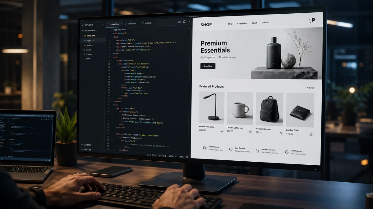
The product page is the most important salesperson
Many product pages contain only an image, a title, a price and a short description. That is not enough when the customer does not already know the product.
A good product page answers the questions a customer would normally ask in a physical store: What is this product suitable for? How is it different from other products? Which variant is right for me? How fast is delivery? What happens after the order? Is there support or advice if needed?
Especially with higher-value products, the product page needs to build trust. Good images matter, but they do not replace clear explanation. People do not buy only because something looks nice. They buy when they understand why it makes sense for them.
That is why product pages should not feel like data sheets. They should be decision pages: clearly structured, benefit-focused, easy to understand and built around the next step.
Categories are SEO pages, not just product lists
Many online shops underestimate category pages. In reality, they are often important for both Google and user orientation.
A strong category page is not just a list of products. It explains what selection the visitor will find, what they should pay attention to and how they can reach the right product faster. Filters, sorting, short introduction texts and clear product groups can make a major difference.
For search terms such as online shop development Switzerland, e-commerce website development or online store for business, the principle is similar: Google and users need to understand immediately what a page is relevant for. Inside a shop, the same is true for product categories.
When categories are structured well, they create better user journeys and better opportunities for organic visibility.
Checkout: The moment where trust is tested
The checkout is the most sensitive part of an online shop. By this point, the customer has shown interest. Now they decide whether they will actually buy.
Many shops lose customers at exactly this stage. Not because the product is bad, but because the process feels complicated. Too many fields, unclear shipping costs, missing payment options or unexpected extra costs can cause customers to abandon the purchase.
A good checkout is calm, clear and short. The customer should always know what they are buying, what it costs, how it will be delivered and which step comes next. In the Swiss market, clarity, seriousness and a clean process are especially important.
The best checkout hardly draws attention to itself. It creates confidence and removes friction.
Trust is not a design detail in e-commerce
On a normal website, trust decides whether someone sends an enquiry. In an online shop, trust decides whether someone pays.
That is why trust needs to be built visibly into the shop. This includes clear contact information, transparent delivery details, understandable product information, a secure-looking order process and a professional overall impression.
Small details matter: a clean header, a calm cart, good readability on mobile, clear buttons, real product images and an interface that does not feel overloaded. A shop can want to sell, but it should not feel aggressive.
A premium online shop does not sell through pressure. It sells through clarity.
Think mobile first, not mobile later
Many customers discover products first on their smartphone. Still, online shops are often planned on desktop and adapted to mobile afterwards. This leads to problems.
On mobile, every second matters. Images need to load quickly, buttons need to be easy to reach, variants need to be simple to select and checkout must not feel difficult.
A mobile shop is not just a smaller version of the desktop website. It needs a user journey that works on small screens: clear order, short sections, visible buying buttons, simple navigation and no unnecessary distractions.
Standard shop or custom development?
Not every online shop needs custom development. For many projects, an established shop system can make sense when products, variants, payment and shipping are relatively standard.
Custom development becomes interesting when the business model has special requirements. This could include product configurators, complex bookings, digital products, member areas, B2B pricing, internal approvals, integrations, custom dashboards or processes that do not fit cleanly into a standard system.
The right question is not: which option sounds more modern? The right question is: which solution fits the business model, daily management and future growth?
A good shop should not only work today. It should remain extendable later.
For online businesses, the shop is often only part of the system
For a traditional retailer, the online shop is the digital sales room. For an online business, it is often part of a larger system.
This can include landing pages, digital products, member areas, automated emails, customer accounts, subscriptions, bookings, download areas or internal admin functions. The shop is then not only a sales surface, but a connection between marketing, product, customer and administration.
This is where it becomes important not to build everything at once. A good online business starts with a clear core: What is being sold? Who is buying it? What does the user need to receive after purchase? Which workflows should be automated?
Once this core works properly, the system can grow.
Selling products also means planning content
An online shop needs good content. Not only for Google, but for real buying decisions.
This includes product descriptions, category content, guides, comparison pages, frequently asked questions and clear information around delivery, usage or product selection. These contents help users decide faster and give search engines more context.
A shop without content has to compete mainly through products and price. A shop with strong content can show trust, advice and specialisation.
This is especially important for new online businesses. A brand that is not yet well known needs to explain why its offer is relevant.
Typical mistakes in new online shops
Many new shops do not fail because of technology. They fail because decisions happen in the wrong order.
A common mistake is designing the shop first and only later thinking about products, content, categories and buying arguments. The shop may look good, but the content does not support the buying journey.
Another mistake is making the first version too large. Too many functions, too many special cases and too many ideas can make the launch slow. A clear shop that sells the most important products well is better than an overloaded shop that never feels finished.
Maintenance is also underestimated. An online shop is not finished after launch. Products change, content needs improvement, new categories appear and order data shows where users drop off or which products should be more visible.
What should be clarified before development starts
Before developing an online shop, businesses should answer several questions. Which products should be sold first? Which categories does the shop need? Which payment methods are relevant? How does shipping or digital delivery work? Who maintains products and content? Which emails should be sent automatically? Which data needs to be visible in the admin area?
The legal side should also not appear only at the end. Legal texts, privacy information, terms, delivery information and other required details should be prepared and checked properly. A developer can create the technical structure, but legal content should be clarified professionally.
The clearer these points are before the start, the better the result will be. A good online shop is not logical by accident. It is planned.
Why SargasWeb is a strong fit for online shop development
SargasWeb is especially suitable for companies and online businesses that do not want a generic shop. The focus is not simply placing products online, but creating a professional buying journey.
This includes a premium visual appearance, clear product structure, responsive implementation, fast loading times, understandable user guidance and a technical foundation that fits the project.
If a shop needs individual functions, the development can go beyond a pure standard solution: customer areas, admin functions, product logic, digital products, bookings or integrations can be built around the business model. The result is a shop that does not only look good, but supports how the business actually sells.
Conclusion: A good online shop leads to a buying decision
An online shop is strong when it makes the buying decision easier for the customer. It does not only show products. It explains value. It does not only look modern. It feels trustworthy. It does not only have a cart. It has a clear buying journey.
For Swiss companies and online businesses, a professional online shop is an investment in visibility, trust and scalable sales.
Planning to have an online shop developed? SargasWeb develops modern online shops for businesses in Switzerland that want to sell professionally and avoid looking like a generic standard store.